What is the True Cost of Poor Customer Visibility?
Poor customer visibility rarely looks like a data problem. It shows up as rising contact volumes, endless manual analysis, failing
Following on from our recent update to the Home screen, which introduced a new way to surface the most pressing issues within your customer conversations, we’ve continued to evolve the EdgeTier experience. The home screen update was designed to help teams stay proactive – making it even faster to spot potential problems before they grow,…
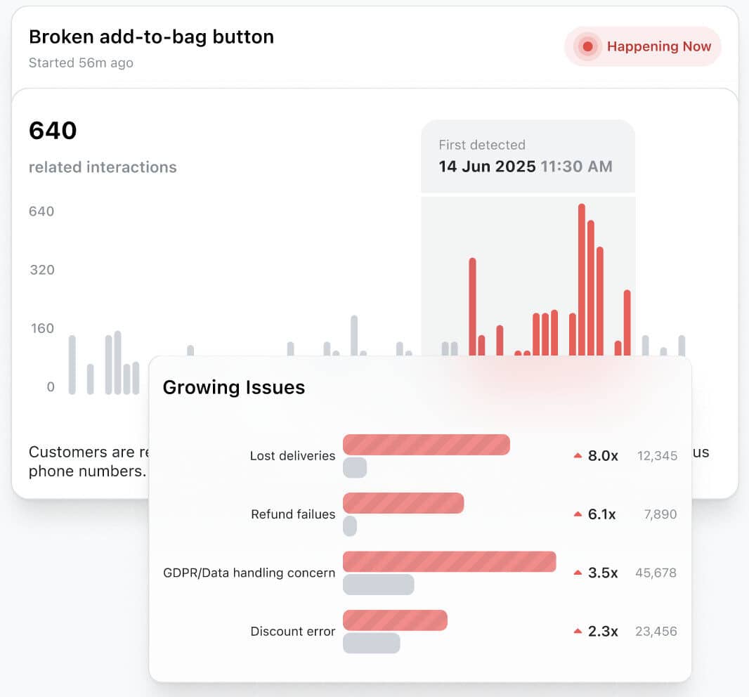

Following on from our recent update to the Home screen, which introduced a new way to surface the most pressing issues within your customer conversations, we’ve continued to evolve the EdgeTier experience.
The home screen update was designed to help teams stay proactive – making it even faster to spot potential problems before they grow, and take action quickly to protect both customer satisfaction and revenue.
Now, we’ve taken another step.
Over the past few months, we’ve been modernising and refining the interface across EdgeTier, not changing how it works, but making it more attractive, faster, and more intuitive to navigate.
It’s not only a visual refresh, we’ve also improved performance behind the scenes. You’ll already notice features and filters loading faster, particularly when working with interactive charts, and there’s more speed improvement to come.

As more teams rely on EdgeTier day-to-day, we want every moment inside the platform to feel enjoyable. From analysts reviewing conversation trends to managers monitoring live issues, the experience should be fast, focused, and easy.
Over time, we’ve added powerful new features, but with growth comes complexity. So, we took a step back and asked a simple question: How can we make the EdgeTier experience as smooth and enjoyable as it is intelligent?
This refresh is our answer.
Every tweak, colour adjustment, and layout refinement was made with one goal in mind: to help you get insights faster, and act on them with confidence.
Some things may have moved, but nothing has been removed. Everything you rely on is still there – now faster to find, clearer to interpret, and more consistent across the platform.
Here are the main updates to know about:
We’ve modernised the platform with updated sizing, spacing, fonts, and colours, creating a sharper, more dynamic interface. The design now features softer, rounded edges, replacing the older square theme, to give EdgeTier a cleaner, more contemporary aesthetic.
We’ve also refined the left-hand navigation with consistent, descriptive naming for each core area: Explore, Sonar, Coach, and Customers – making it faster to move through the system.

Our emojis have been redesigned to be brighter, clearer and more fun to interpret at a glance, helping users assess sentiment faster and with greater accuracy.

The symbols that represent different interaction types have been updated, making it easier to instantly identify whether an interaction is an email, chat, or call — and what type of issue or tone it reflects.
Before


Within Explore, everything has been rethought for speed and readability.
These updates help you find emerging issues and opportunities in fewer clicks.

On the right-hand side, the new filter menu makes it easier than ever to dive into specific segments of your data.
It’s cleaner and more responsive, allowing you to instantly filter by emotion, key KPIs like Longest Agent Handling Time, or metrics such as CSAT.

When you click into a specific interaction, you’ll immediately notice a more structured and readable layout:

We’ve made significant developments to the Coach module in recent months – improving performance, modernising the design, and expanding what teams can do inside EdgeTier.
Thanks to our work with ClickHouse, Coach now loads faster than ever, making it quicker to explore reviews, scorecards, and agent performance data in real time. The interface has also been refreshed to match the new EdgeTier look, with clearer layouts and smoother navigation.

Beyond speed and design, Coach is now a more complete QA and performance toolkit:
If you haven’t used Coach yet, this is the best time to start. It brings structure, visibility, and consistency to agent reviews, all built directly into EdgeTier.
We’re continuously shaping the product around how the best customer operations teams work: giving them faster visibility into what’s happening, and the insights to act proactively rather than reactively.
The new interface reflects that philosophy – helping you get to insights faster, navigate with less effort, and see customer patterns more clearly than ever before.
If you’d like a quick walkthrough of what’s new, or support getting set up with the latest features, please reach out to your Customer Success Manager.
Poor customer visibility rarely looks like a data problem. It shows up as rising contact volumes, endless manual analysis, failing
This article originally appeared on Edge Signals – Bart Lehane’s LinkedIn newsletter on customer experience, analytics, and AI. Follow for
Retail contact centres face intense pressure during the festive period and January returns surge. This article explains how real-time anomaly

Nick Brazitis
Global Customer Care Manager
"The anomaly feature is a game changer for us. It’s highly accurate and has helped us identify customer issues, agent errors, and even fraud that would have taken us longer to catch."

James Waghorn
Director of Customer Contact
"EdgeTier is no ordinary software product... It has completely changed how we work at CarTrawler."

Deborah Guivisdalsky
COO
"We now have highly detailed understanding of agent performance, not just on key agent metrics, but also on how customers react to our agents and the emotions of our customers feel when talking to our team."
Let us help your company go from reactive to proactive customer support.
Unlock AI Insights